WORLD OF FRUIT MUSEUM
World of Fruit (WOF), an immersive art installation and museum, approached me with a vision to transform the way people experience fruit. Tasked with developing a brand system from scratch, we set out to create something unexpected—something that would challenge conventional perceptions of fruit and invite people into an entirely new world.
The goal was to craft a brand that felt otherworldly, bold, and playful, blending art and nature in a way that was both striking and inviting. We played with vibrant colors, dynamic spaces, and playful design elements to make the experience feel fresh, immersive, and unforgettable—turning the everyday into something extraordinary.
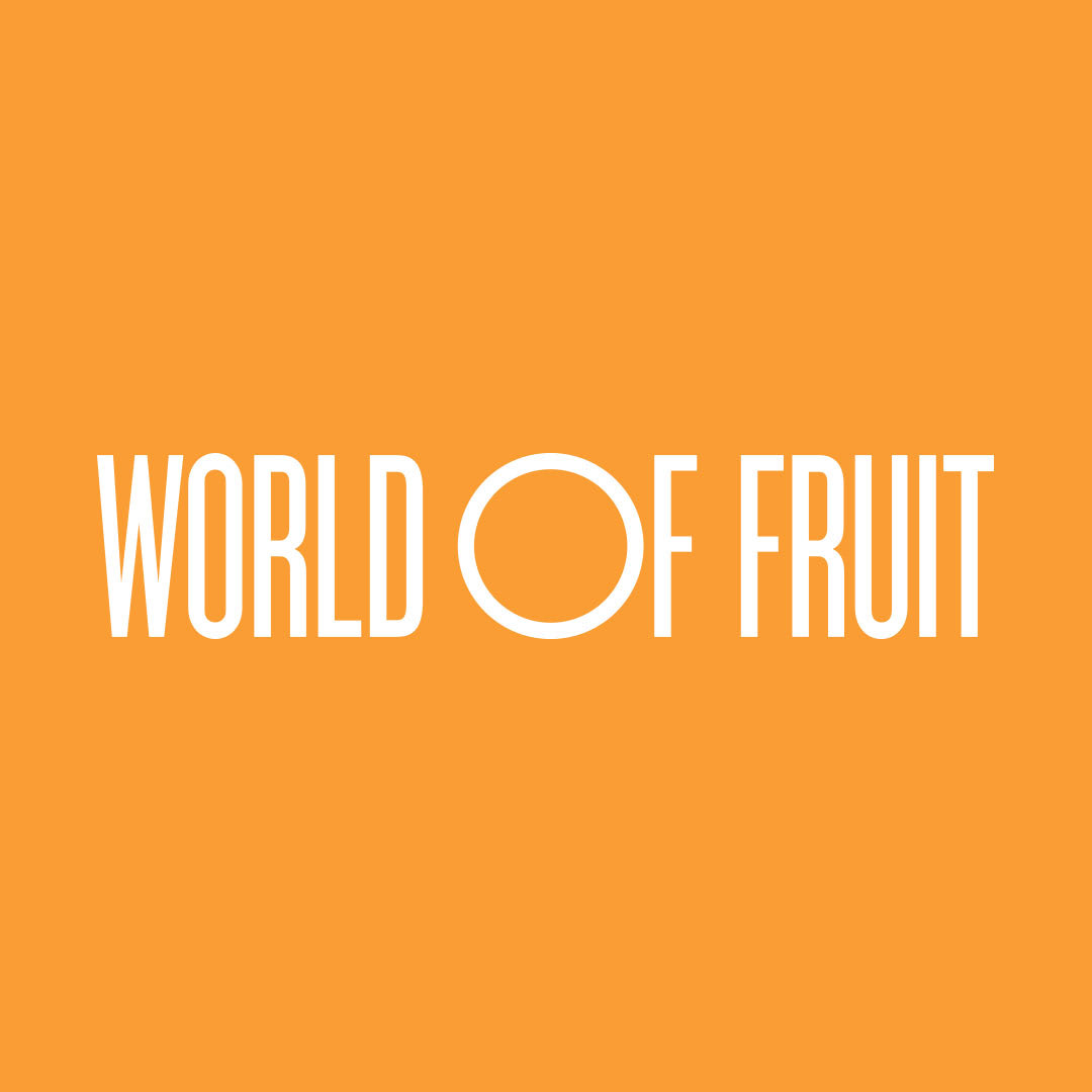

LOGO
The World of Fruit logo focuses heavily on the ‘O’ which is a subtle way to represent the Earth. Earth is what sustains and creates the fruit that the museum is focusing on. The ‘O’ can be used as a framing device which encompasses images, illustrations, copy, etc. to promote this idea.
World of Fruit Identity Design
2020
Client: World of Fruit
-
Team:
Design Direction: Ayla Kim
Design System: Ayla Kim, Taryn Oshiro-Wachi
3D Artist: Mier Lee
